portfolio
Branding for the Orbis Global Loyalty Platform
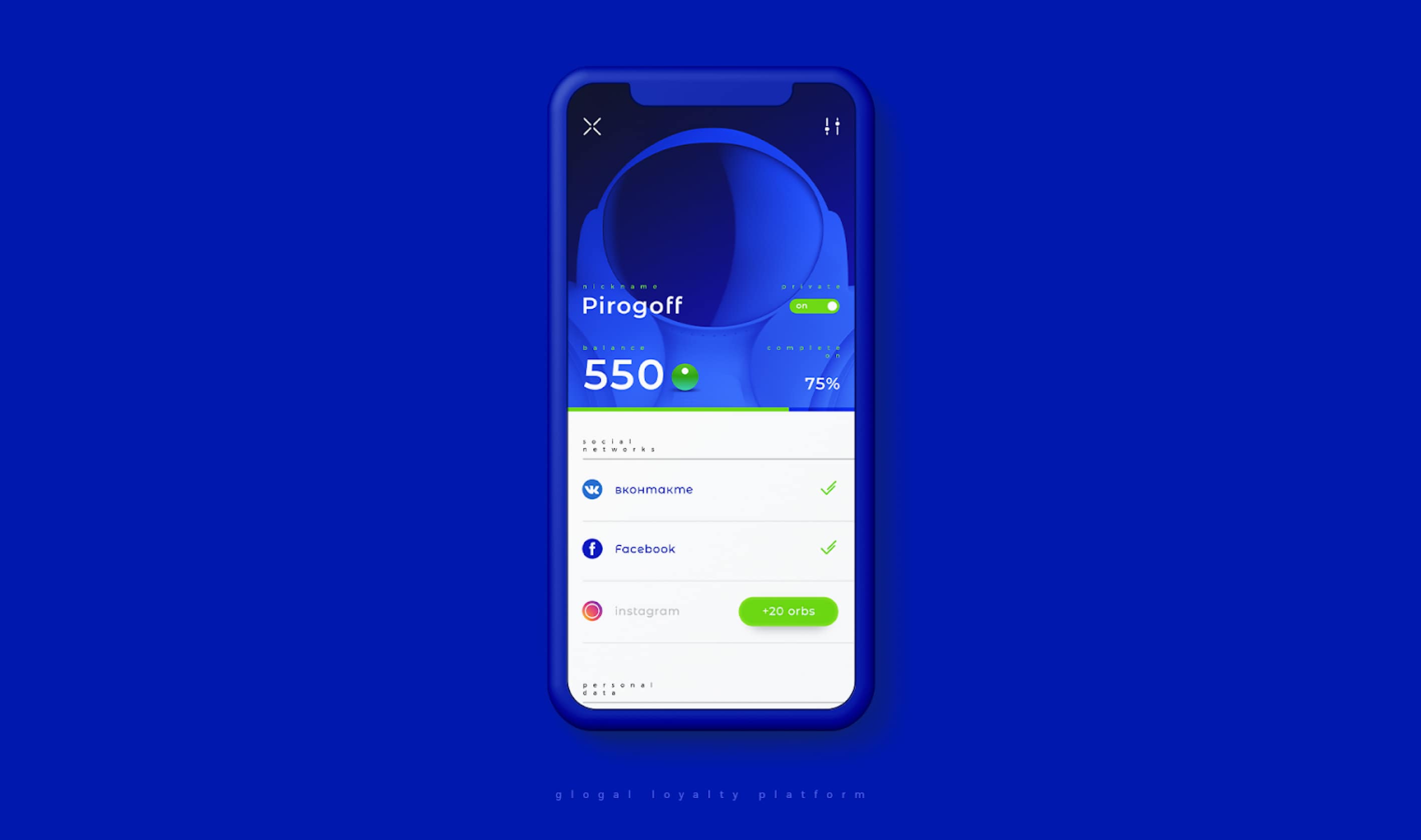
Orbis is a coalition loyalty program that brings together the interests of both platform partners (B2B) and their customers (B2C). The platform allows you to automate the processes of building high-quality and long-term relationships between them.
August, 2018
Task
To create a unique branding for a Startup company that enters the regional market. It was necessary to make the branding of the loyalty program bright, memorable and ideological. We had to develop not only an identity, but also a metaphor for the brand itself.
Solution
We strengthened the idea of a loyalty program and its goal of bringing local businesses together using the metaphor of planetary gravity. Having chosen a deep blue as the main color, we began to create a universe around Orbis. The client really liked our metaphor, and we took on creating other elements of the identity.

Process
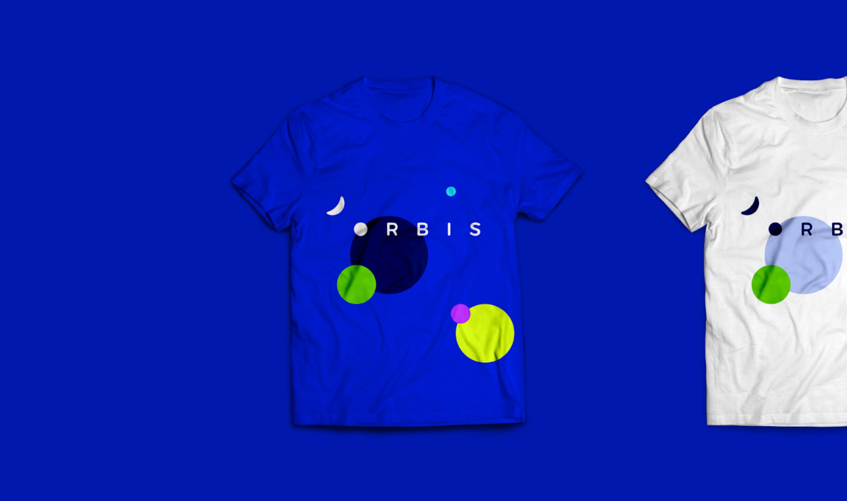
For physical media, we decided to strengthen the identity of a rapidly developing company with bright color accents that suit it. They express the dynamics of brand development. We chose simple geometric shapes that represent the planets and allow the organic use of branding elements, regardless of the shape and texture of the object which they are placed on.
For more conservative partners and official documents, our designers chose more laconic colors, which set the tone of a serious attitude towards the brand, the possibility of scaling.

Result
We have solved the client's problem by giving dynamics to the brand identity and strengthening the metaphor of “gravity”. The chosen color scheme, in particular deep blue, has become an excellent synonym for stability, mutually beneficial conditions and a deep relationship to understanding the client.
